
Brand Identity, Brand Development
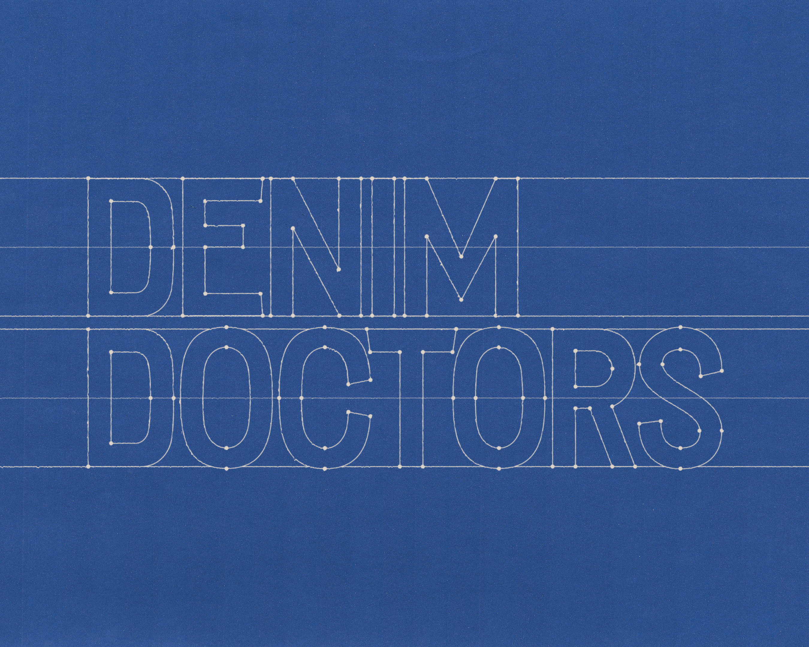
Denim Doctors
Denim Doctors had existed for over 30 years without a formal identity—built instead on reputation, word of mouth, and an obsessive dedication. Founded by Zip Stevenson in 1994 out of a love for vintage denim and repair, the shop has since become a global destination. Our goal was not to renew Denim Doctors, but to reveal what had always been there. Drawing from the language of vintage Americana, medical iconography, and the subtle authority of long-gone clothing brands, we developed a system that feels both inevitable and classic.
Read More

Brand Identity, Brand Development
Hyperbola
The visual identity of Hyperbola is built on clarity and precision. Every element follows a disciplined grid system, creating order across all formats. This structure allows information to be presented with balance and proportion, whether in small-scale applications or large environments. By adhering to these standards, the identity communicates reliability, professionalism, and timeless design.
Read More

Brand Identity, Brand Development
STOCK
Stock was founded in 2012 as a heritage fashion brand, manufactured entirely in Chicago. After building a strong cult following, they were asked to create a custom uniform for the staff at Alinea, a world renowned restaurant. They grew to be an indispensable partner to some of the greatest hospitality establishments in the world and needed an updated branding to match. Taking inspiration from contemporary fashion and vintage Italian design, we created a recognizable, scalable brand identity to set them aside from run-of-the-mill uniform suppliers.
Read More

Brand Development, Merchandise
Arc Music Festival
Celebrating Chicago as the birth place of House Music, ARC brings the global scene back home to it's origins once every August. We collaborated with them to create a collection of merchandise inspired by the vintage rave scene, channeling Y2K motifs and 00s interpretations of techno. We were able to redo their logo, and chose to simplify it in order to have a lot of freedom with the graphic treatments.
Read More
Brand Development, Packaging

Dog is Human
By combining veterinary research with human-grade wellness, Dog is Human has raised the standard of pet health. While they were still developing their brand in 2022, we were hired to create a logo and packaging for their Multivitamin that reflected their commitment to dog health and wellness.
Given the in-depth research backing their brand, we knew it was important to invoke the feeling of human, innovative science within their identity. With that in mind, the product was targeting millennials who see their dog as family, and it needed to feel balanced — premium but not intimidating.
To reach our target, we took inspiration from modern supplement packaging and added playful notes, like the subtle "tail" at the end of their logo. We chose a dark amber bottle as a nod to supplements (and a genuine utility), but contrasted it with a soft light blue and contemporary fonts to make it trustworthy while still being youthful.
Dog is Human has had great success since launching, making a noticeable mark in pet health. 'Human-Grade' has since become a sought after benefit and much more available on the market.
Since launching their Multivitamin, we also helped design the packaging for their second official release — Multiflex, a powder topper for advanced hip & joint support.
Following the rules of our original packaging system, we were able to expand the visual identity across an additional SKU, utilizing a different color scheme but the same familiar application.
Read More
Brand Development, Packaging
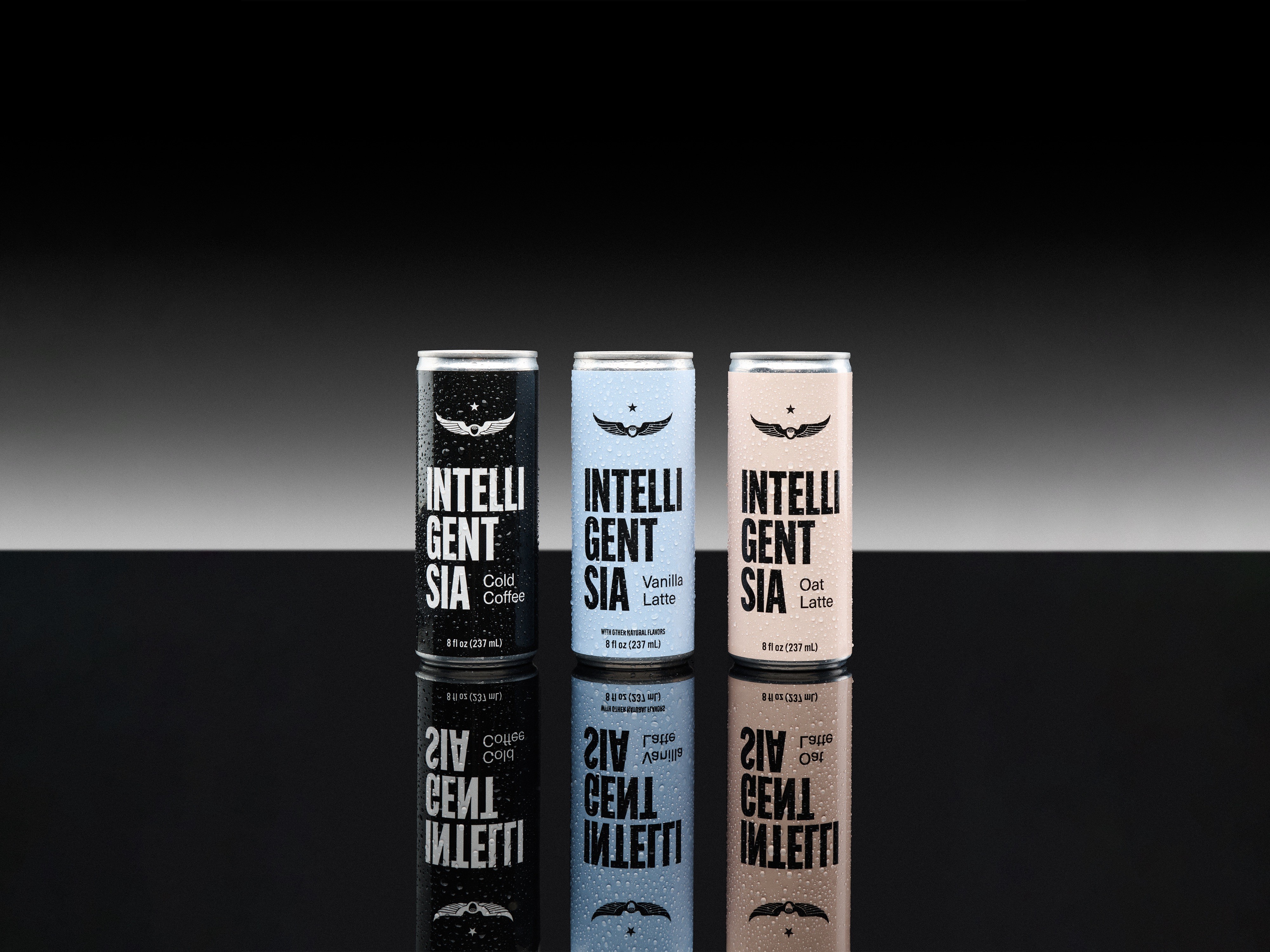
Intelligentsia Cold Coffee
Intelligentsia is a legacy coffee roaster based in Chicago.
Their Cold Coffee was already a popular ready-to-drink product line, but the brand wanted to refresh the packaging to appeal to a wider customer base.
After a positive debut for our design update on their Oat Lattes, we gained some freedom to play with their branding and create an alternative logo for the can.
Their Cold Coffee is brewed hot and flash chilled, and we wanted the new packaging to show Intelligentsia with an edge. Something that understands a quick lifestyle, keeps it simple, and sets itself aside from the go-to canned coffees that it competes with at stores like Whole Foods or Jewel.
To roll out the new line, we created a campaign that leaned into the legacy side of their brand through an homage to vintage advertising. Commercials that feel like half-remembered dreams from childhood, and print ads that look like they've been ripped from a magazine in the 60s.
Since launching, Intelligentsia has adopted the refreshed logo treatment to their Signature Blend packaging and staff merchandise and store design — most prominently featured in their new Seoul café (we're huge in Korea).
Read More
Featured Client List
Year
Brand
Tags
Sector
2026
Mighty Bites
Pet, Pet Wellness
2026
Loewy Foods
Brand ID, Brand Development
Food, Hospitality
2025
Intelligentsia
Packaging, Brand Development
Coffee, CPG
2025
Acacia + Mason
Brand ID, Brand Development
Hospitality, Lifestyle
2025
Pairfect Pathways
Brand ID, Brand Development
Wellness, Therapy
2024
Onekind
Packaging, Brand Development
Wellness, Skincare
2023
Bronzeville Hoagie + Panini Cafe
Brand ID, Brand Development
Food, Hospitality
Mimieux by Becca Smith ©2026